VILDSODA
Branding, Visual Identity, Packaging Design & Copywriting
Client: Nyckelbryggerier
Concept & Creative Direction: Linnea Härjerud, Bestis
Art Direction & Design: Linnea Härjerud, Bestis
Naming & Copywriting: Linnea Härjerud, Bestis
For Nyckelbryggerier’s new craft soda, I developed the complete brand concept. From name and positioning to visual identity, packaging design and copy.
The result was Vildsoda: a distinctive Swedish soda brand rooted in Norrbotten, made with real berries and designed to feel as vibrant, authentic and refreshing as the landscape that inspired it.


The challenge
The ambition was to create a brand that would stand out on the shelf while communicating the product’s natural ingredients, local origin and craft character.
The identity needed to feel genuinely Swedish without becoming nostalgic or predictable. It also had to balance the wildness of the northern landscape with a contemporary, playful and commercially strong expression.
The name
The name Vildsoda was developed to capture both the untamed character of Swedish nature and the refreshing personality of the drink.
It is simple, memorable and immediately expressiv, giving the brand a strong foundation for both storytelling and visual identity.
The visual identity
The identity was inspired by the distinctive flora of Norrbotten.
I created an iconic wordmark with subtle references to runic forms, giving the brand a sense of place and character without feeling historical. Stylised berries and wild plants were integrated into the graphic language, creating a direct but playful connection to the soda’s key ingredients.
The colour palette was drawn from the rich tones of the real berries used in the products, supported by a complementary typographic system for headlines, body copy and product information.
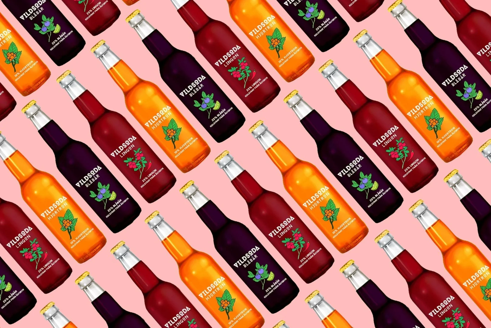
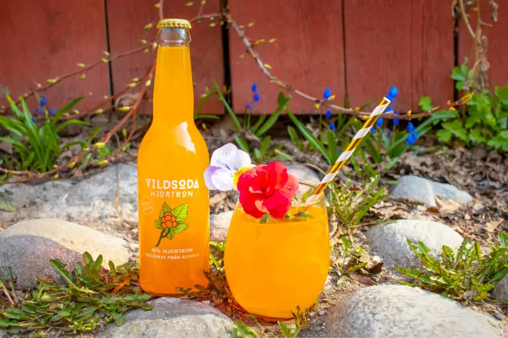
The packaging
The packaging was designed to create immediate shelf impact while allowing the product itself to remain visible.
Transparent labels were used to let the colour of the soda become part of the design. Bold botanical illustrations, strong branding and carefully structured information created a clean and modern expression with a distinct craft feel.
To strengthen the local connection and add personality, each label also featured playful “Did you know?” facts related to the ingredients, nature and northern Sweden.
The result
The final brand brought together naming, identity, packaging and copy into one coherent and recognisable experience.
Vildsoda was designed to do more than catch the eye. It communicates the pleasure of drinking a Swedish craft soda made with real berries; vibrant, local and just wild enough.