

POLYVER SWEDEN
Visual Identity, Brand Strategy, Positioning & Design Implementation
Client: Polyver Sweden
Art Direction & Creative Direction, positioning: Linnea Härjerud Balk
Print Design & UI/UX: Linnea Härjerud Balk
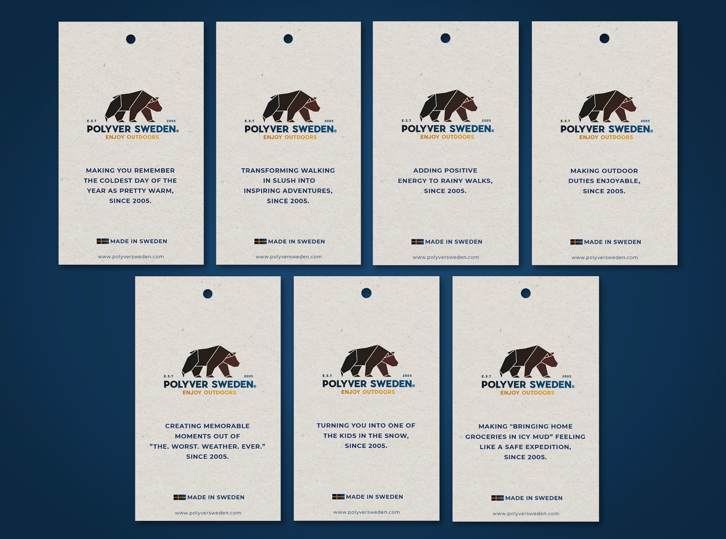
Copywriting: Linnea Härjerud
Agency: Louder Family
A selection of work from the rebranding process I led for Polyver Sweden.
The project spanned strategy, positioning, visual identity, naming, digital design, packaging, product design and campaign production. The images and movies below offer a glimpse of the final brand world, and further downn below, i describe the work.
The full project includes a much broader range of applications, concepts and design assets.


Let’s watch some film
The challenge
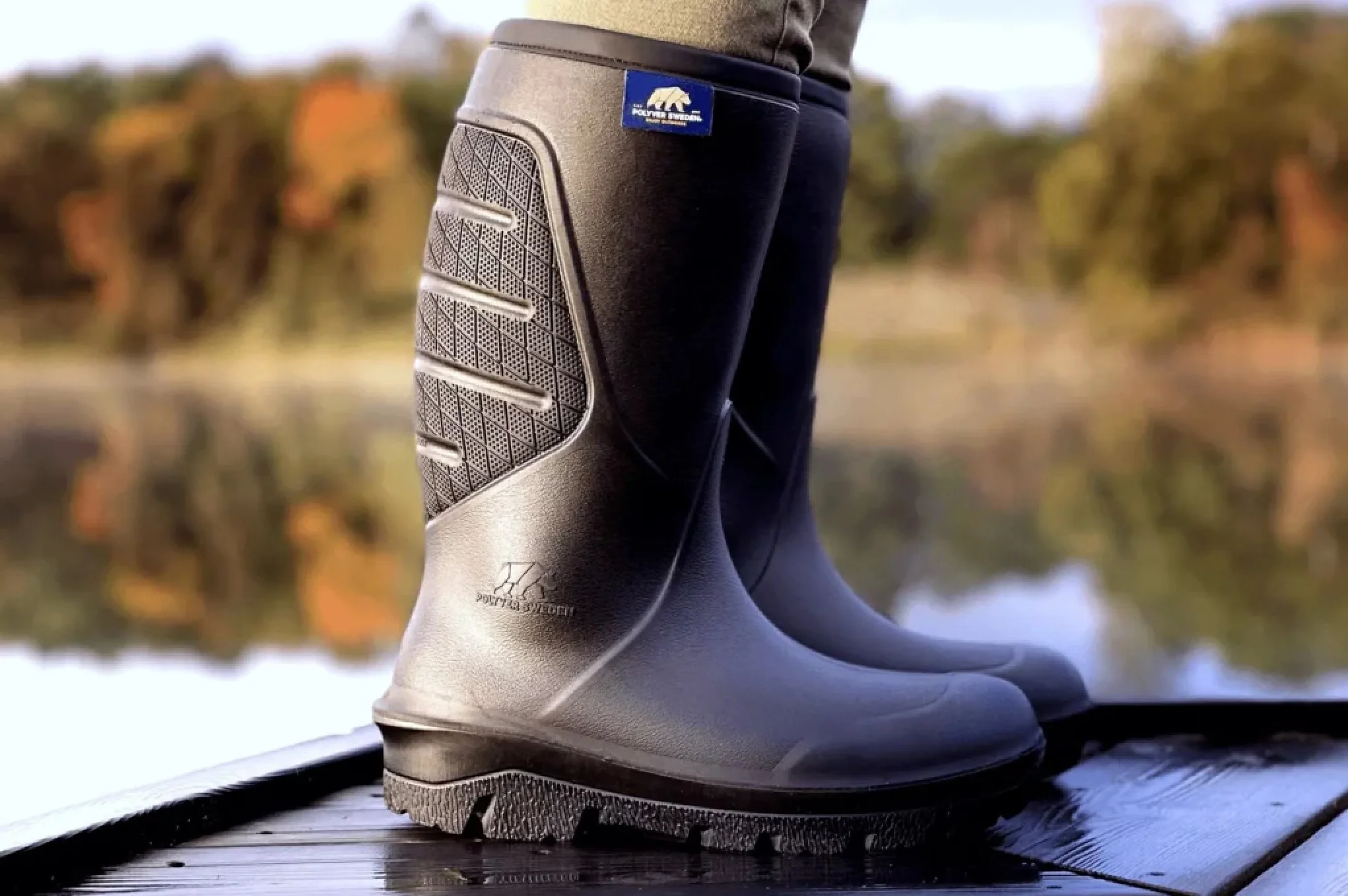
Polyver Sweden creates warm, lightweight and waterproof footwear designed to perform in temperatures as low as –40°C.
The challenge was to build a brand that could communicate both technical excellence and a strong connection to Swedish nature while feeling contemporary, inclusive and relevant to a broader international audience.
Through my 4D Branding method, I uncovered that many people were unclear about what the Polyver brand stood for, leading to misleading associations with a tough, hard-edged attitude.
I developed a new positioning centred on timeless quality, warmth and comfort, with a clear promise of products designed to enrich life outdoors. I also brought greater emphasis to the fact that the products are made in Sweden, reinforcing their quality, durability and craftsmanship.
The new brand needed to work across multiple international markets, including the Nordics, Germany, France, the UK, the US and Russia.
The strategic foundation
Using my Dimensional Branding method, I led Polyver through an in-depth positioning process that defined the brand’s direction, personality and visual expression.
The result was a cohesive identity designed to work across every touchpoint, from e-commerce and packaging to product communication, campaign films and physical products.
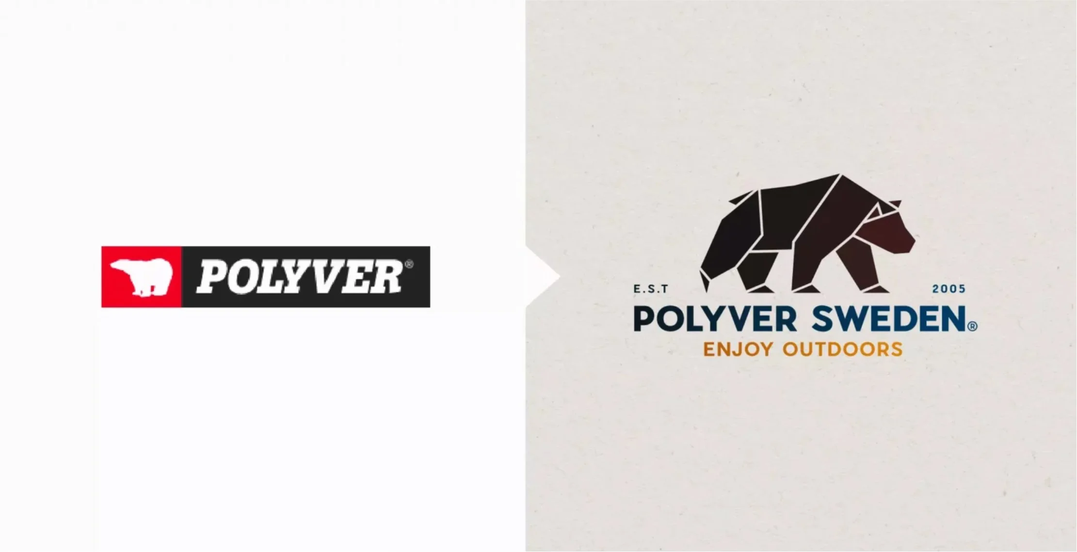
The name
The name Polyver Sweden became a central part of the repositioning.
“Polyver” combines ideas of polymer and versatility, reflecting the brand’s technical innovation and adaptable products. The addition of “Sweden” strengthens the connection to origin, craftsmanship and quality, rooted in the company’s production in Jämtland.
The visual identity
The new identity was designed to balance advanced performance with natural authenticity.
A soft, earthy colour palette and tactile paper textures create warmth and approachability, while the imagery draws heavily on Swedish landscapes, movement and outdoor life.
The result is a brand world that feels both technically credible and distinctly human.
The logo
The logo combines contemporary typography with a stylised, forward-moving brown bear: a symbol of strength, warmth, endurance and momentum.
A supporting typographic system for headlines and body copy creates consistency across both digital and physical communication.
From identity to application
I was responsible for the positioning, design and art direction of the full visual system, including:
E-commerce website and UI/UX
Packaging design
Product design
Campaign films
Product communication
Print and digital applications
Every element was designed to feel part of the same world: recognisable, functional and unmistakably Scandinavian.
The ambition was for each touchpoint to feel considered enough to stand on its own, while still contributing to one strong and coherent brand experience.
CLI-tech
As part of the rebrand, we also introduced CLI-tech: Comfort, Lightness and Insulation.
This ingredient brand was created as a clear quality marker for Polyver’s core technical strengths, helping customers understand the performance behind the product.
The result
The new identity was met with strong enthusiasm both internally and externally. Following the rebrand, Polyver Sweden achieved record-breaking sales; a clear sign that the new positioning and identity had made a real commercial impact.
Within only two months of launch, Polyver Sweden saw significant growth and a much clearer market position. The rebrand gave the company a stronger foundation for future expansion and turned the relaunch into a clear commercial and creative success.